
Rude Olive is a snack brand built for people who like bold flavors, strong opinions, and a little attitude. FTC Studio created a distinctive brand identity and packaging system that transforms the humble olive from a traditional pantry staple into a modern, culture-driven snack.
Olives are typically presented through traditional Mediterranean cues, natural colors, and familiar food packaging. The challenge was to break away from those conventions and create a brand that could reposition olives as a desirable, contemporary snack—especially for a younger, design-conscious audience.
ABOUT THE PROJECT


A bold custom wordmark became the foundation of the identity, supported by oversized typography, unexpected colors, expressive photography, playful copy, and packaging that puts the product itself on display. Rather than relying on traditional olive-green aesthetics, the system uses high-contrast black and white alongside mint, yellow, purple, blue, and orange to build a louder and more recognizable visual world.

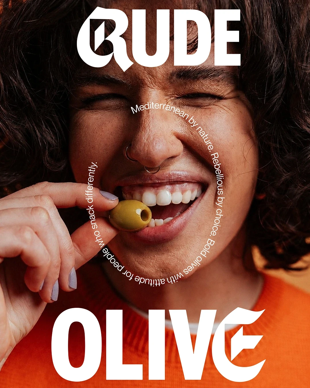
The result is a flexible identity and packaging system that makes Rude Olive instantly recognizable across the shelf, social media, campaigns, and outdoor advertising. What was once an everyday ingredient becomes a snack with its own voice—bold, playful, rebellious, and unmistakably Rude.


©2026 Digital Experience Studio
Next Projects
Explore more brands, products, and experiences shaped through strategy, design, and technology.

